
Concept creation using the Relume Style Guide builder
Learn how to build a homepage concept with the Relume Style Guide Builder.
In this doc you'll learn how to:
- Generate a concept
- Create multiple concepts
- Generate & customize colors
- Apply color schemes to your homepage concept
- Generate & customize typography
- Generate & customize UI elements
- Share your concepts
The Relume Style Guide Builder lets you define a reusable visual system (colors, typography, and UI elements) and apply it across your project before exporting to Figma or Webflow.
Generate a concept
You can create a style guide for any project that already has a sitemap and wireframes.
- Go to the Style Guide tab at the top.
- Use AI generation to create your first concept; Relume will suggest colors, typography, and base UI settings.
- Use the surprise me button (purple button, top right) to generate a new concept using AI.
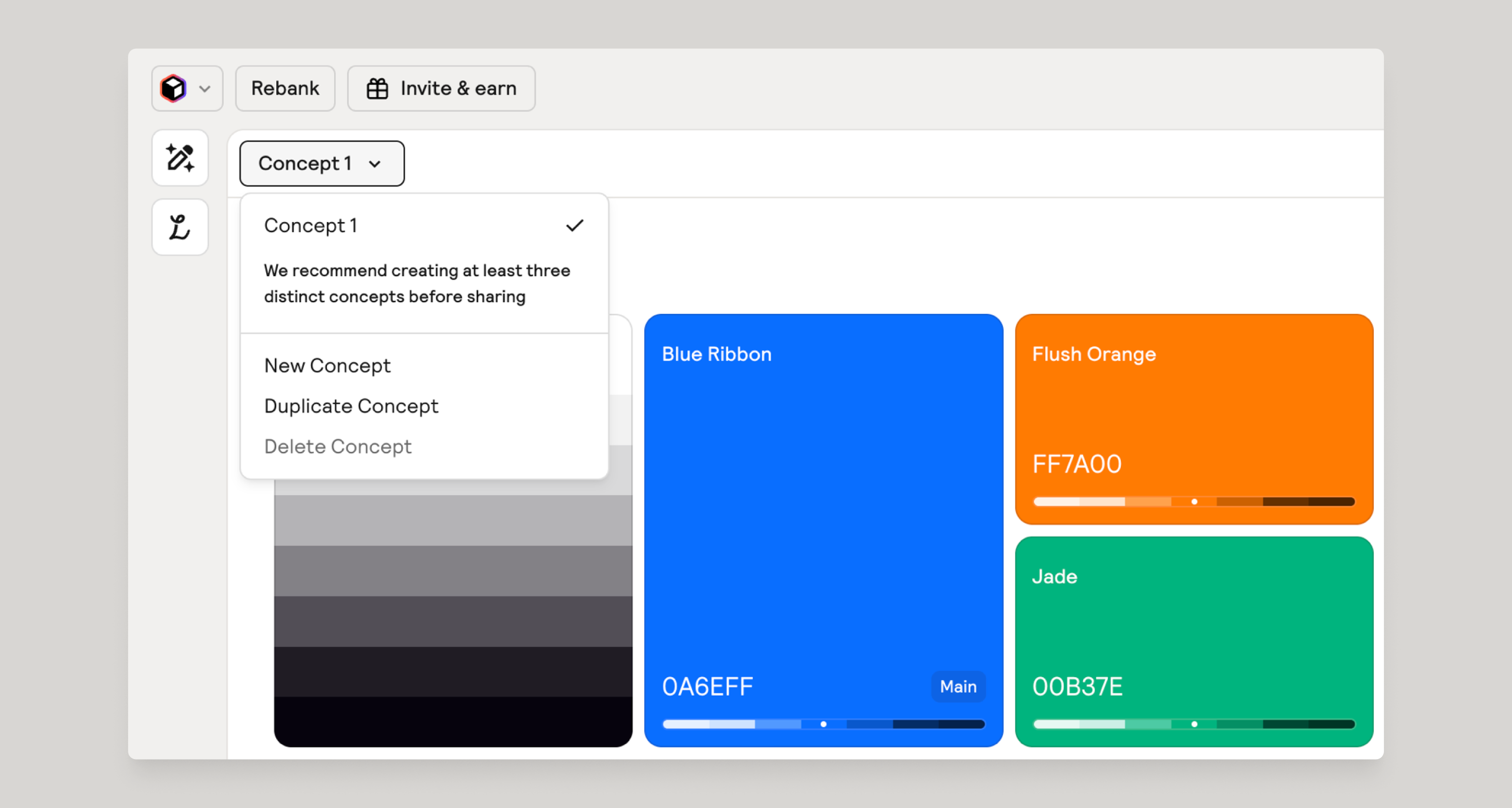
Create multiple concepts
You can create multiple concepts to share different visual directions with stakeholders.
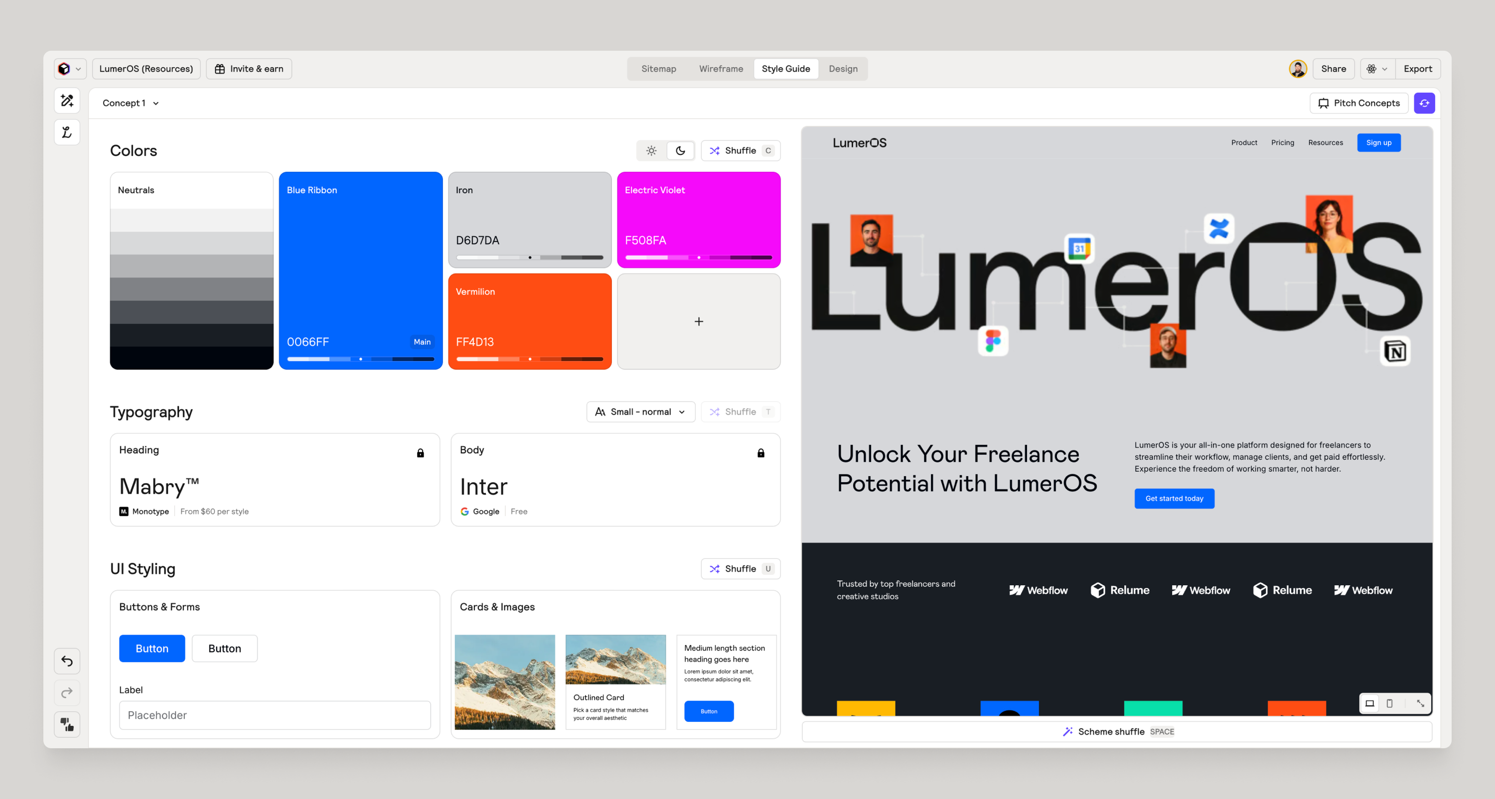
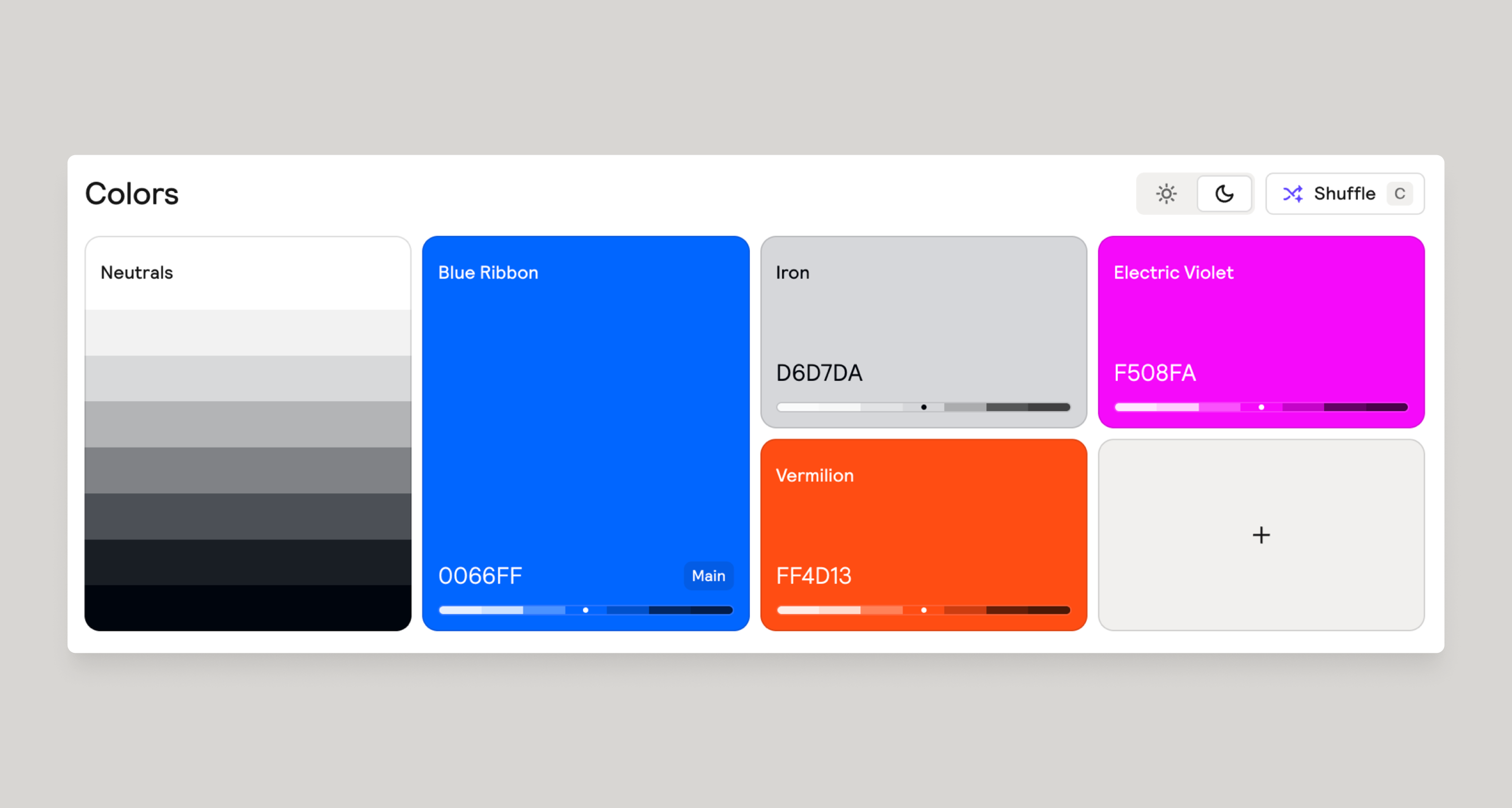
Generate & Customize Colors
The Colors panel is where you define the color palette.
- Open your style guide concept and go to Colors.
- Review the AI-suggested brand, accent, and neutral colors.
- Adjust colors using a color picker to better match your client’s brand.
- Toggle light or dark themes for a quick, contrasting feel. Note: this is not intended to be a toggle for light/dark modes but rather inverting colors or contrast of the overall concept.
- Shuffle the color suggestions if you want a new direction while keeping your typography or other settings.
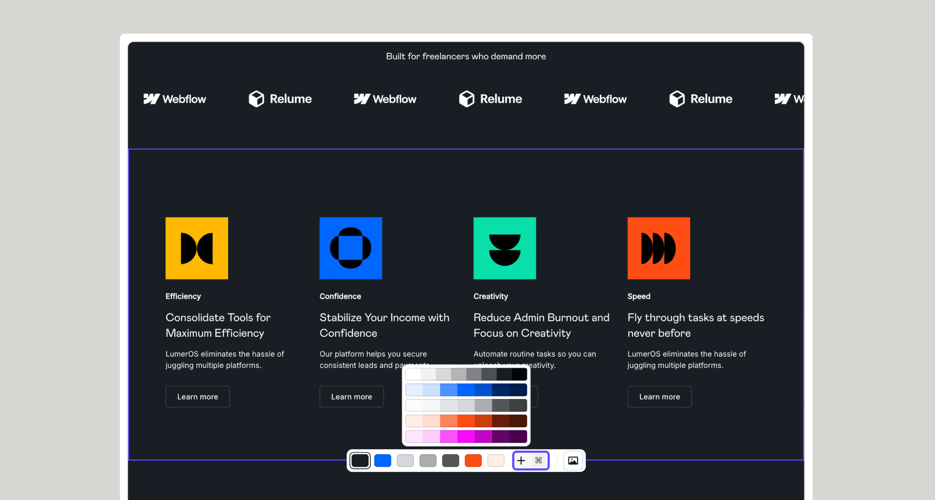
Apply color schemes to your homepage concept
To customize a section with color schemes, follow these steps:
- Hover over a section and you’ll see a set of color swatches.
- Each swatch is a color scheme set (background, foreground, text and border colors).
- Clicking on a swatch will apply that color scheme to that section.
- To remove a color scheme simply click twice on a swatch.
- You can click on a section to cycle through the swatches in the order they appear in the hover menu.
- You can shuffle color schemes by hitting spacebar.
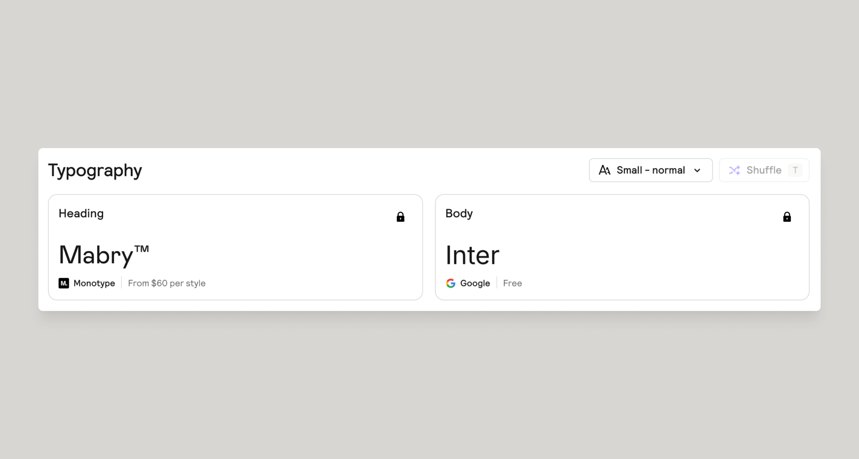
Generate & Customize Typography
Typography settings define headings, and body text styles across the style guide.
- Choose heading and body fonts, ideally based on brand guidelines or shuffle to get inspiration.
- Adjust size, weight, and style for that perfect look.
- Lock in the heading or body text and shuffle for more variations.
When exported to Figma & Webflow, these styles map to Font styles, HTML tags and global classes in the Relume Figma Kit or Webflow Style Guide.
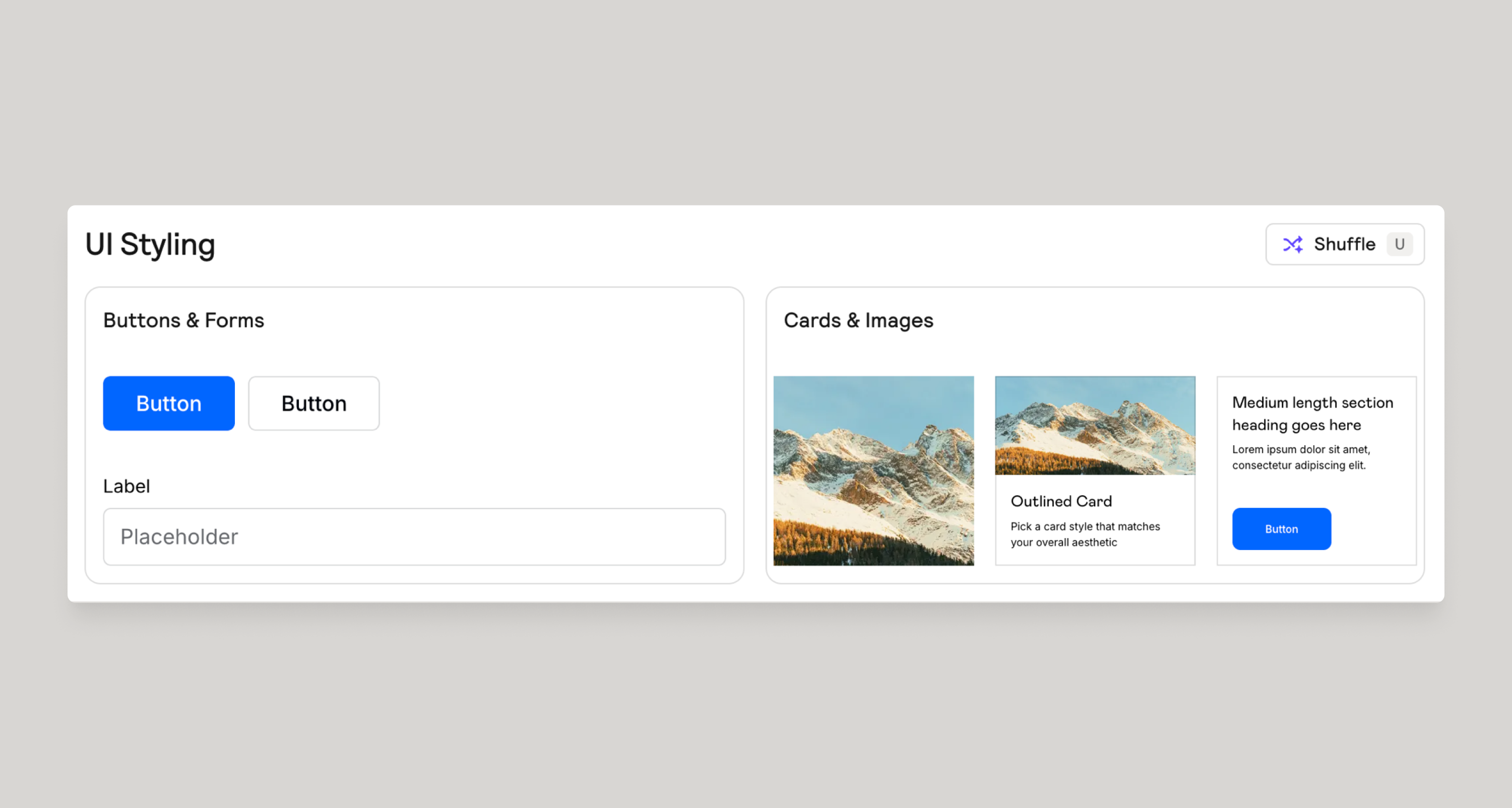
Generate & Customize UI Elements
UI settings describe how your colors and typography are used in components like buttons, inputs, images and cards.
- Choose how primary and secondary buttons, cards, and form fields are styled.
- Only the homepage concept will allow for generated images. To generate images, simply hit i (eye) on your keyboard or shift click on a section to cycle through images for just that section.
- Shuffle the UI styling options for inspiration.
These decisions inform how sections look when your style guide is applied in Design view and later implemented in Figma & Webflow.
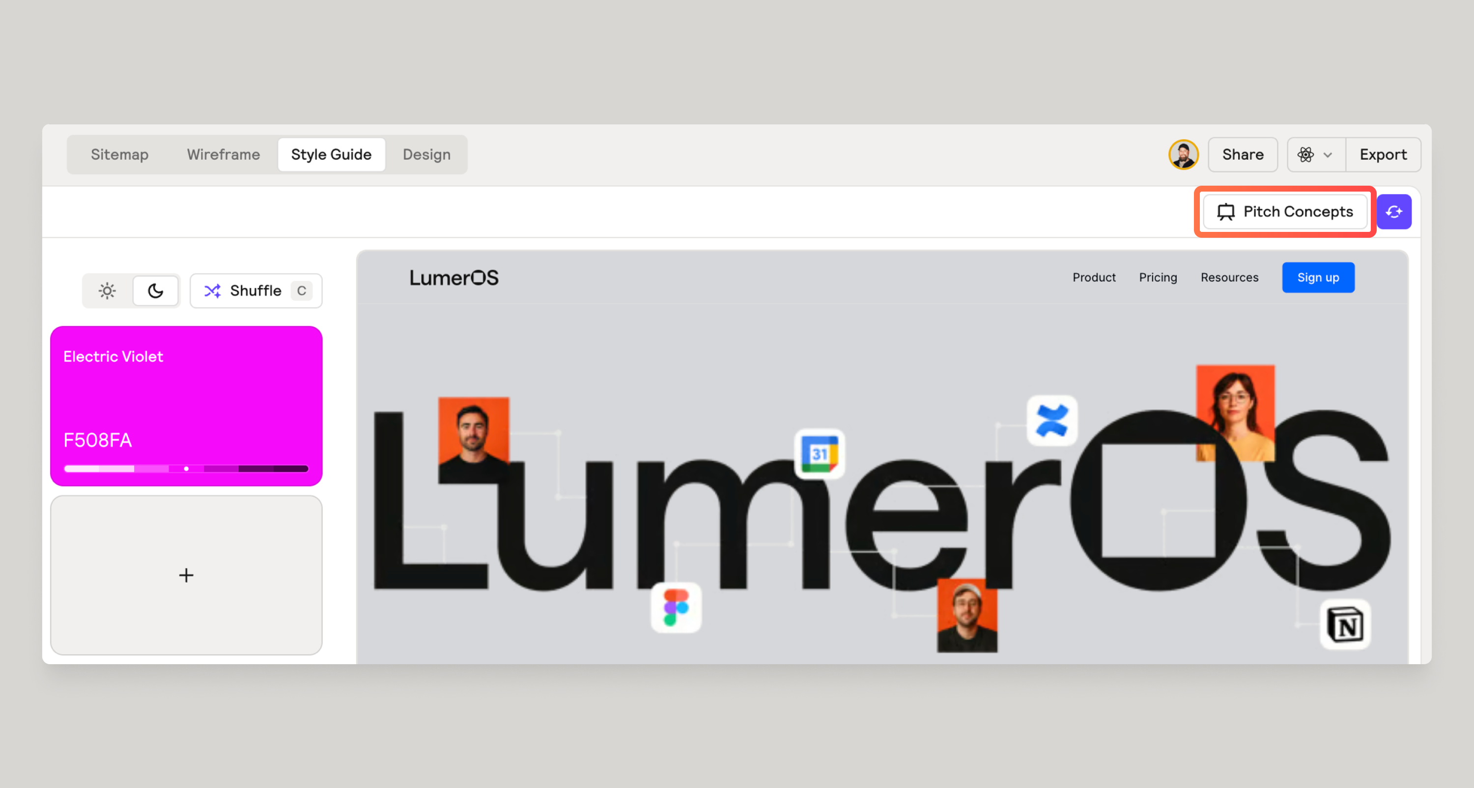
Share your concepts
Your style guide is ready for primetime. It’s time to share with your clients!
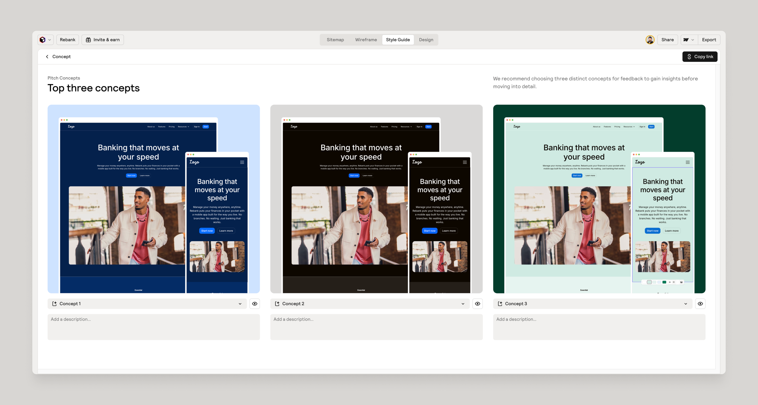
- Click on Pitch Concepts at the top right corner.
- You’ll be presented with your top 3 concepts and you have a chance to show or hide them here or write a short description.
- Click on the Copy Link button top right to share with your clients.
Give feedback
Was this resource helpful?
